

Creating a calm and inviting atmosphere in your home starts with the colors you choose. Colors have a powerful influence on mood and perception, and selecting the right palette can help transform your living spaces into peaceful retreats. Whether you’re repainting a single room or planning your entire home’s color scheme, focusing on calm colors is a great place to start.
In this post, we’ll explore practical tips for choosing calm colors that contribute to a soothing environment. From understanding the psychology of color to pairing shades effectively, these insights will guide you toward making thoughtful and beautiful choices.
Understanding Calm Colors
Calm colors are typically soft, muted, and subtle shades that evoke feelings of relaxation and tranquility. They are often found in nature, such as the soft blues of the sky, gentle greens of leaves, and warm neutrals like sand or cream.
Common Calm Colors
– Soft Blues: Known for promoting serenity and reducing stress.
– Gentle Greens: Symbolize harmony and balance, connecting indoors with nature.
– Warm Neutrals: Colors like beige, taupe, and soft gray provide a comforting backdrop.
– Lavenders and Pastels: Light purples and pale pinks can create a gentle, soothing vibe without overwhelming a space.
Tips for Choosing Calm Colors for Your Home
1. Consider the Room’s Purpose
Before picking a color, think about how you will use the room. Calm colors work well in spaces designed for relaxation, such as bedrooms, living rooms, and bathrooms. For example:
– Bedrooms: Soft blues or muted greens can promote restful sleep.
– Living Rooms: Warm neutrals paired with pastel accents encourage comfort and calm socializing.
– Bathrooms: Light, airy colors like pale gray or lavender help create a spa-like feel.
2. Test Colors in Different Light
Colors can appear different depending on the light source and time of day. Always test paint samples on your walls before making a final decision. Observe:
– How the color looks in natural daylight.
– Its appearance under artificial lighting (warm and cool bulbs).
– How it changes throughout the day.
This process prevents surprises and ensures your chosen calm color maintains the right tone.
3. Use a Neutral Base
Starting with a neutral base color offers flexibility and makes it easier to add accents. Neutral colors like off-white, cream, or soft gray provide a peaceful foundation while allowing you to introduce calm accent colors through furniture, textiles, or décor.
4. Incorporate Natural Elements
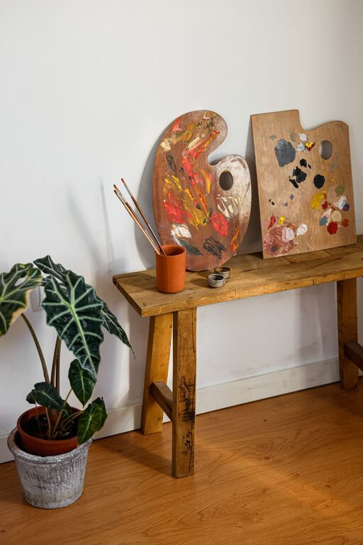
Pair calming colors with natural materials such as wood, stone, or plants. This combination enhances the soothing effect by connecting indoors with the outdoors, which is naturally calming.
5. Create Color Harmony
Choosing colors that complement each other helps maintain a sense of balance and calm in your home. Look for colors that are next to each other on the color wheel (analogous colors) such as blue and green or soft pink and lavender. Avoid overly contrasting colors, which can add energy rather than calm.
6. Use Soft Finishes
The finish of your paint influences how colors appear. Matte or eggshell finishes tend to soften colors, reducing glare and helping to create a relaxing atmosphere. High gloss finishes may reflect more light and feel less soothing.
7. Keep it Simple
Less is often more when aiming for calmness. Avoid too many colors in one space. Stick to two or three complementary colors to keep the room feeling cohesive and peaceful.
8. Don’t Forget Textures
If you prefer to keep walls neutral but still want a calm vibe, add textures through fabrics, rugs, curtains, and cushions. Textures in soothing tones add depth and comfort without overwhelming the space.
Examples of Calm Color Combinations
Here are a few tested calm color pairings to inspire your choices:
– Pale blue and cream: Creates a fresh and airy feel perfect for bedrooms.
– Soft green and warm taupe: A natural and grounded palette ideal for living rooms.
– Light gray with lavender accents: Offers a sophisticated and gentle atmosphere.
– Warm beige and dusty rose: Adds warmth while maintaining softness.
Final Thoughts
Choosing calm colors for your home is a wonderful way to foster peace and relaxation in your everyday environment. By considering the function of each room, testing colors in natural light, and focusing on harmonious, soft palettes, you’ll create a sanctuary that feels welcoming and restful.
Remember, there’s no single “right” calm color. Your personal preferences and the feel you want in your home matter most. Take your time exploring colors, and don’t hesitate to consult with paint professionals or interior designers if you want extra guidance.
With these tips in mind, you’re well on your way to creating a beautifully calm and comfortable home.
—
Feel free to share your favorite calm colors in the comments! What shades have worked best in your space?